Customize your internal comms' look and feel
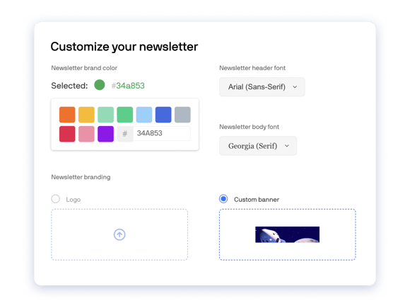
HQ gives you both guardrails and freedom. Its format is proven to boost engagement. Your colors, logo, and email-safe font make it uniquely you.
Flexible formatting, intentional design
Every element of an Axios HQ update is designed to keep your readers focused. From its single-column format to the line breaks between cards, we'll take the guesswork out of what will work. All you have to think about is what goes in it.

Keep your brand front and center
Keep your HQ updates high-impact. You can style your header with a simple logo or a high-touch banner so readers see — right away — the brand they know, trust, and believe in. That friendly face will guide them deeper into your update.

Customize your editor for every update
Have 10 topics to cover today? HQ has you covered with 10 cards. Have one big announcement tomorrow? Try a single-item update to make it stand out. Whatever internal updates you need to share, HQ's editor is as flexible as you are.
Primary, secondary, and background colors
If there's a hex code for it, HQ can do it. Choose the accent color that aligns with your brand, add it to HQ, and the flourishes in your internal communications will deliver the pop of color your readers know you for.
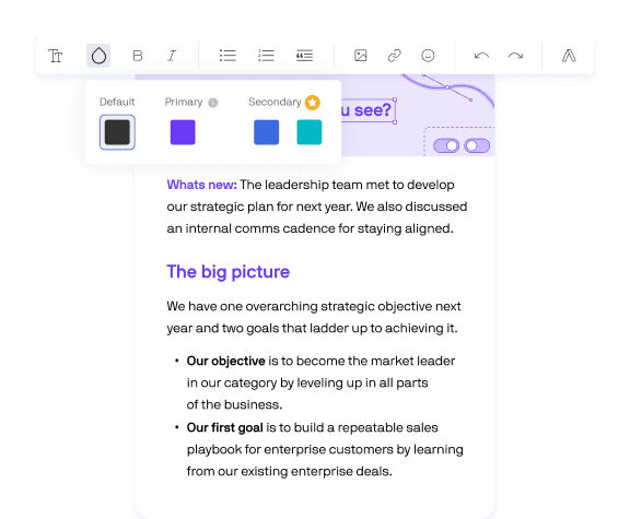
![]() Advanced feature: Define more primary and secondary colors to decorate and elevate your internal communications. Set your newsletter color — using any hex code — and up to two others to customize the colors you can add to your text and what the background of your communication is.
Advanced feature: Define more primary and secondary colors to decorate and elevate your internal communications. Set your newsletter color — using any hex code — and up to two others to customize the colors you can add to your text and what the background of your communication is.
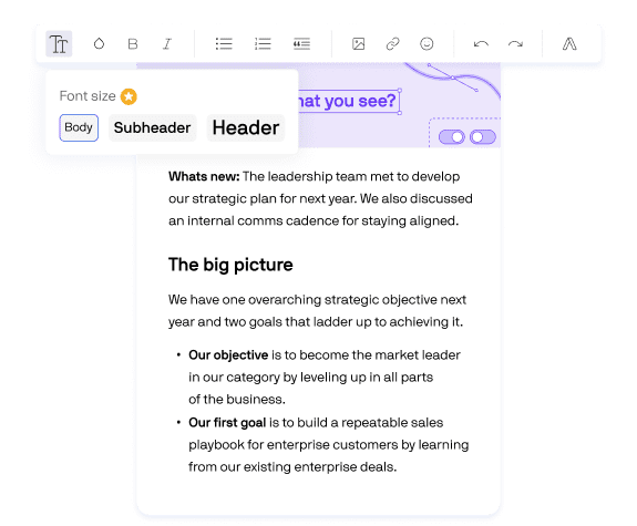
Custom font and three pre-set sizes
![]() Advanced feature: Expand beyond Axios HQ's pre-loaded library of web safe fonts. Define and designate the brand fonts your organizations has installed and uniquely uses — and choose from a series of pre-formatted font sizes and sub-headers to amplify your information hierarchy.
Advanced feature: Expand beyond Axios HQ's pre-loaded library of web safe fonts. Define and designate the brand fonts your organizations has installed and uniquely uses — and choose from a series of pre-formatted font sizes and sub-headers to amplify your information hierarchy.
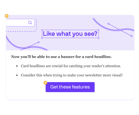
Card headers and buttons
![]() Advanced feature: Tailor each card you include in your communications. Use a headline to let readers know what's ahead — or opt for a banner image boost visual flair and definition. Stylized buttons draw even more attention to the CTAs that matter to you.
Advanced feature: Tailor each card you include in your communications. Use a headline to let readers know what's ahead — or opt for a banner image boost visual flair and definition. Stylized buttons draw even more attention to the CTAs that matter to you.
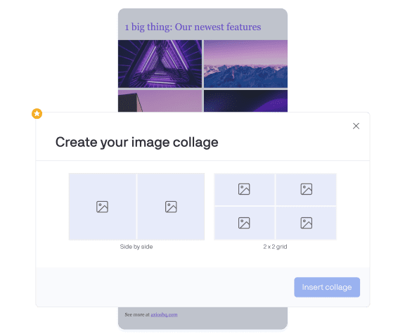
Photo layouts
![]() Advanced feature: Grids give you even more flexibility in how you arrange and display images in your internal communications. As always, you can still use a full-width image at the top or in the body of your cards, as well as shrink or left, center, right align them.
Advanced feature: Grids give you even more flexibility in how you arrange and display images in your internal communications. As always, you can still use a full-width image at the top or in the body of your cards, as well as shrink or left, center, right align them.
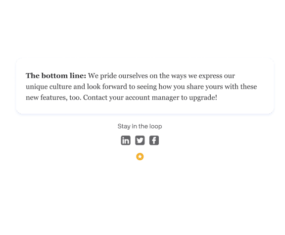
Remove HQ logos and add custom footers
![]() Advanced feature: Simplify and customize your HQ templates. You can remove HQ logos, define, design, and add a custom footer — and lead your audience to the legalese or social links you care about most.
Advanced feature: Simplify and customize your HQ templates. You can remove HQ logos, define, design, and add a custom footer — and lead your audience to the legalese or social links you care about most.

Keep your brand front and center
Keep your HQ updates high-impact. You can style your header with a simple logo or a high-touch banner so readers see — right away — the brand they know, trust, and believe in. That friendly face will guide them deeper into your update.

Customize your editor for every update
Have 10 topics to cover today? HQ has you covered with 10 cards. Have one big announcement tomorrow? Try a single-item update to make it stand out. Whatever internal updates you need to share, HQ's editor is as flexible as you are.

Primary, secondary, and background colors
If there's a hex code for it, HQ can do it. Choose the accent color that aligns with your brand, add it to HQ, and the flourishes in your internal communications will deliver the pop of color your readers know you for.
![]() Advanced feature: Define more primary and secondary colors to decorate and elevate your internal communications. Set your newsletter color — using any hex code — and up to two others to customize the colors you can add to your text and what the background of your communication is.
Advanced feature: Define more primary and secondary colors to decorate and elevate your internal communications. Set your newsletter color — using any hex code — and up to two others to customize the colors you can add to your text and what the background of your communication is.

Custom font and three pre-set sizes
![]() Advanced feature: Expand beyond Axios HQ's pre-loaded library of web safe fonts. Define and designate the brand fonts your organizations has installed and uniquely uses — and choose from a series of pre-formatted font sizes and sub-headers to amplify your information hierarchy.
Advanced feature: Expand beyond Axios HQ's pre-loaded library of web safe fonts. Define and designate the brand fonts your organizations has installed and uniquely uses — and choose from a series of pre-formatted font sizes and sub-headers to amplify your information hierarchy.

Card headers and buttons
![]() Advanced feature: Tailor each card you include in your communications. Use a headline to let readers know what's ahead — or opt for a banner image boost visual flair and definition. Stylized buttons draw even more attention to the CTAs that matter to you.
Advanced feature: Tailor each card you include in your communications. Use a headline to let readers know what's ahead — or opt for a banner image boost visual flair and definition. Stylized buttons draw even more attention to the CTAs that matter to you.

Photo layouts
![]() Advanced feature: Grids give you even more flexibility in how you arrange and display images in your internal communications. As always, you can still use a full-width image at the top or in the body of your cards, as well as shrink or left, center, right align them.
Advanced feature: Grids give you even more flexibility in how you arrange and display images in your internal communications. As always, you can still use a full-width image at the top or in the body of your cards, as well as shrink or left, center, right align them.

Remove HQ logos and add custom footers
![]() Advanced feature: Simplify and customize your HQ templates. You can remove HQ logos, define, design, and add a custom footer — and lead your audience to the legalese or social links you care about most.
Advanced feature: Simplify and customize your HQ templates. You can remove HQ logos, define, design, and add a custom footer — and lead your audience to the legalese or social links you care about most.
Make your message stand out
HQ helps you pull readers in, makes key details stand out, and lets your readers have moments of rest.



How Happy Money earns 73% open rates on its weekly updates
Their fully distributed workforce needed a regular cadence of communication from the CEO and other leaders to stay connected and energized.
Read their case studyMore about design customizations
How do you structure an internal newsletter?
What should an internal newsletter contain?
How do you make an internal newsletter interesting?
1. Focus on your audience.
2. Grab their attention.
3. Write like a human.
4. Subject-verb-object.
5. Be short, but not shallow.
6. Keep copy scannable.
7. Stop when enough is enough.
Hear Axios CEO Jim VandeHei's TEDx talk on effective internal communication.


.webp)








.webp)
